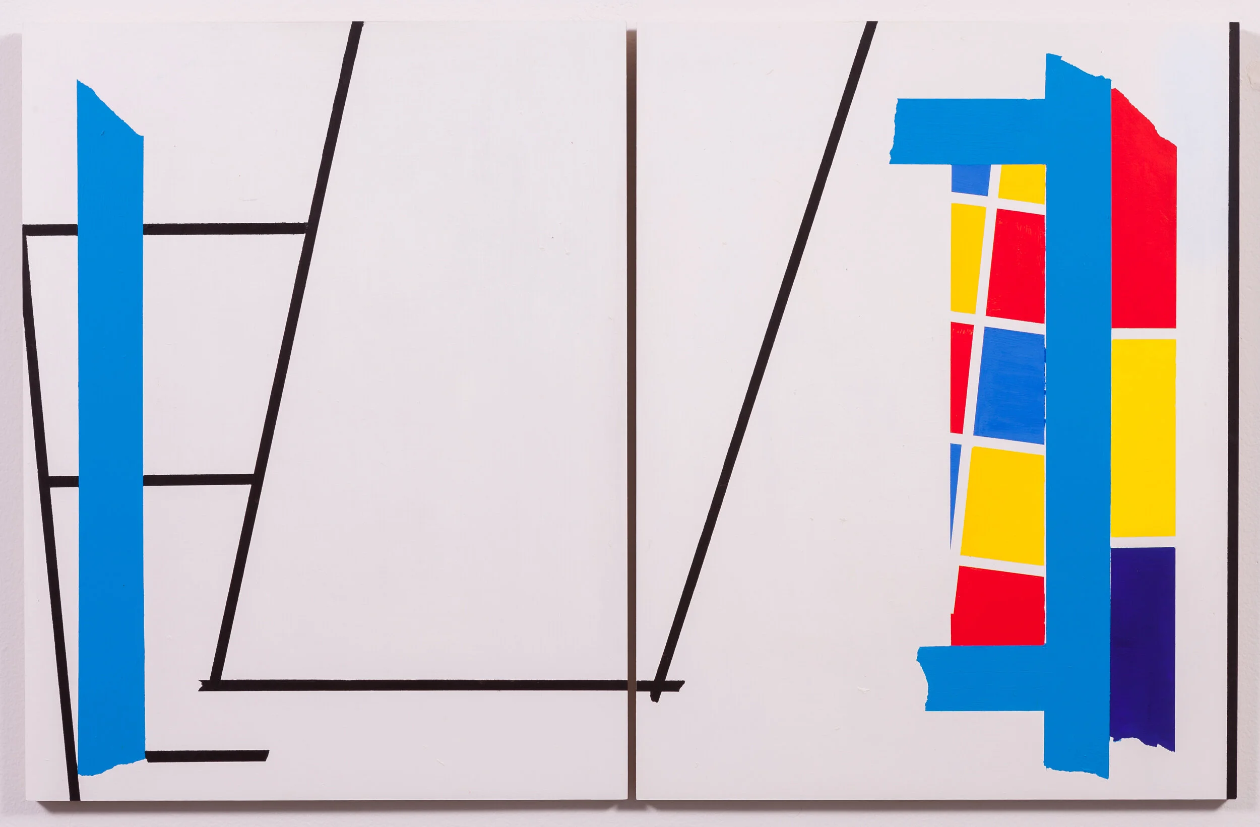
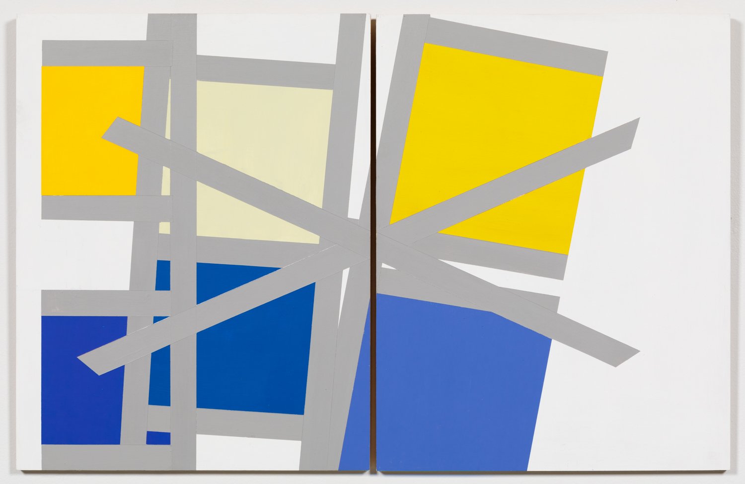
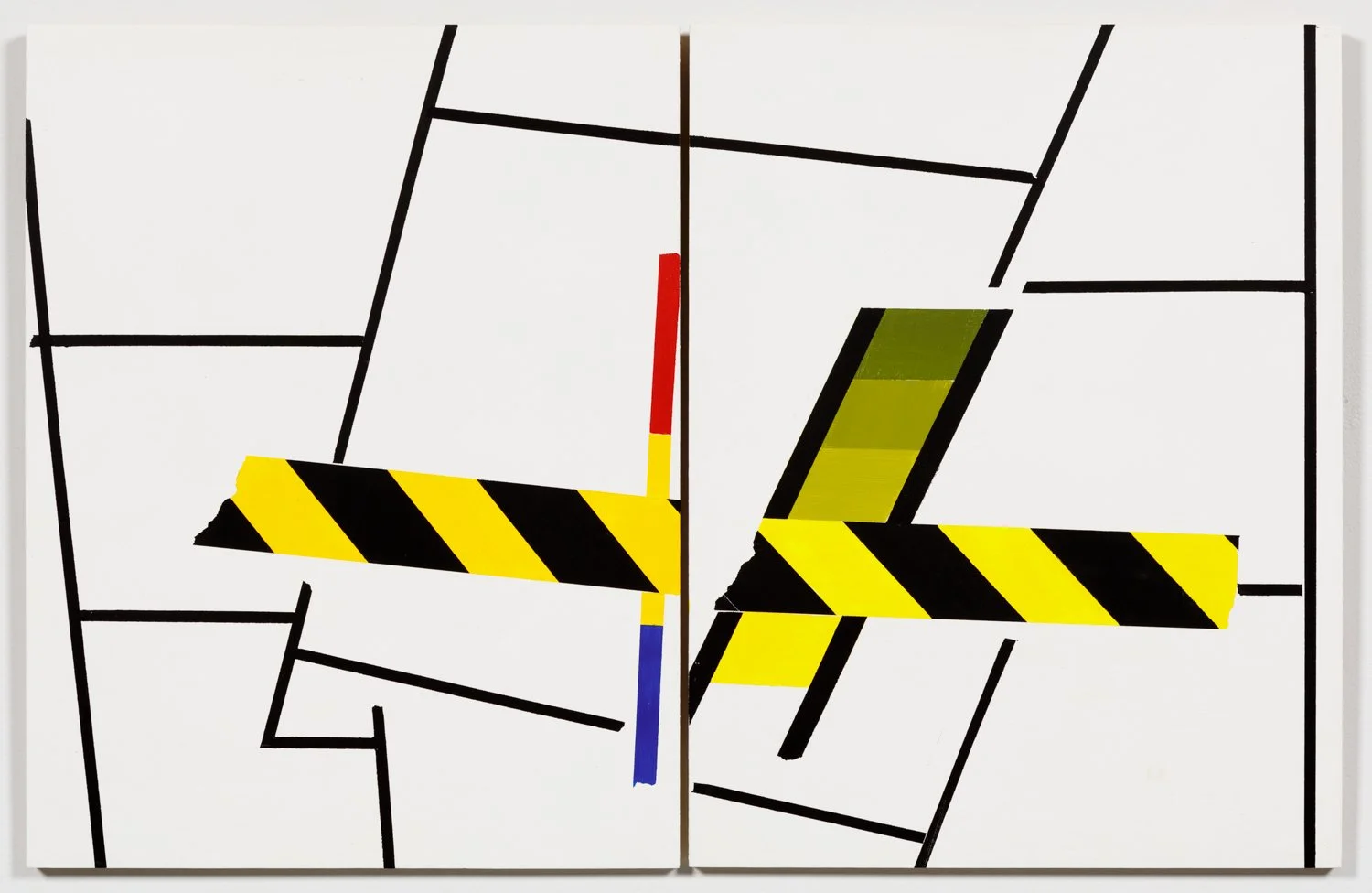
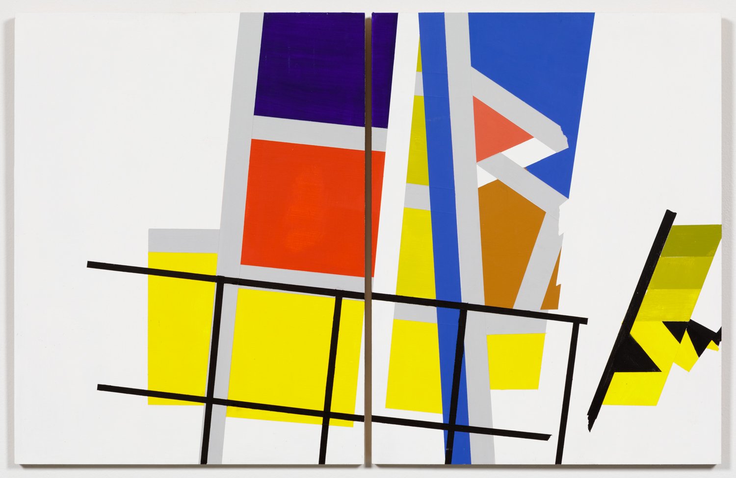
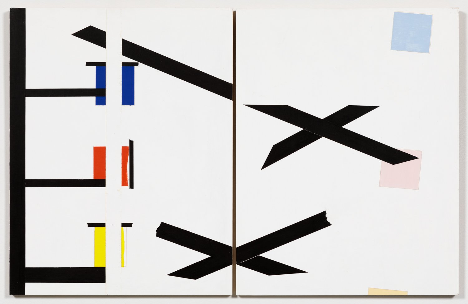
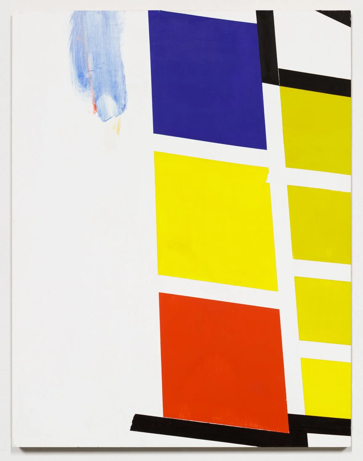
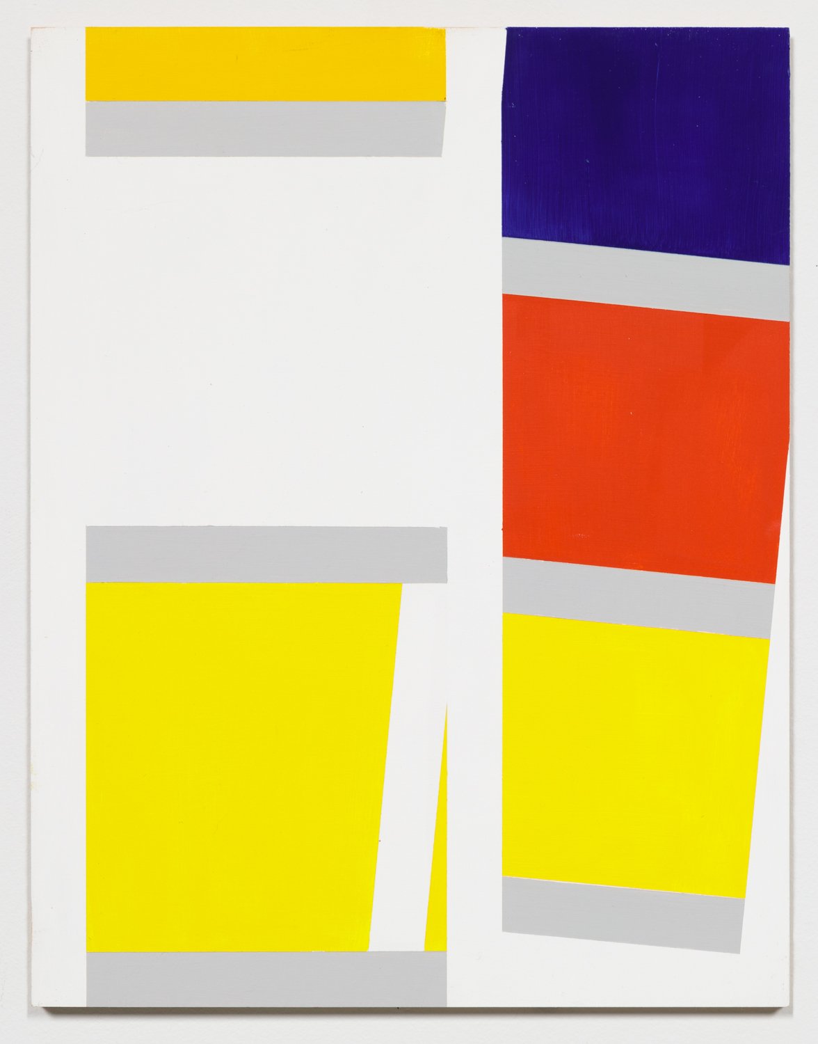
The Indecidability of the Sign: Red/Yellow/Blue
2000s--
acrylic on board, 18”h x28 ¼” (diptych)
Exceptions are 12”h x 18 ¼” w (diptych)
For further works in the series, see exhibition Aaron Gallery
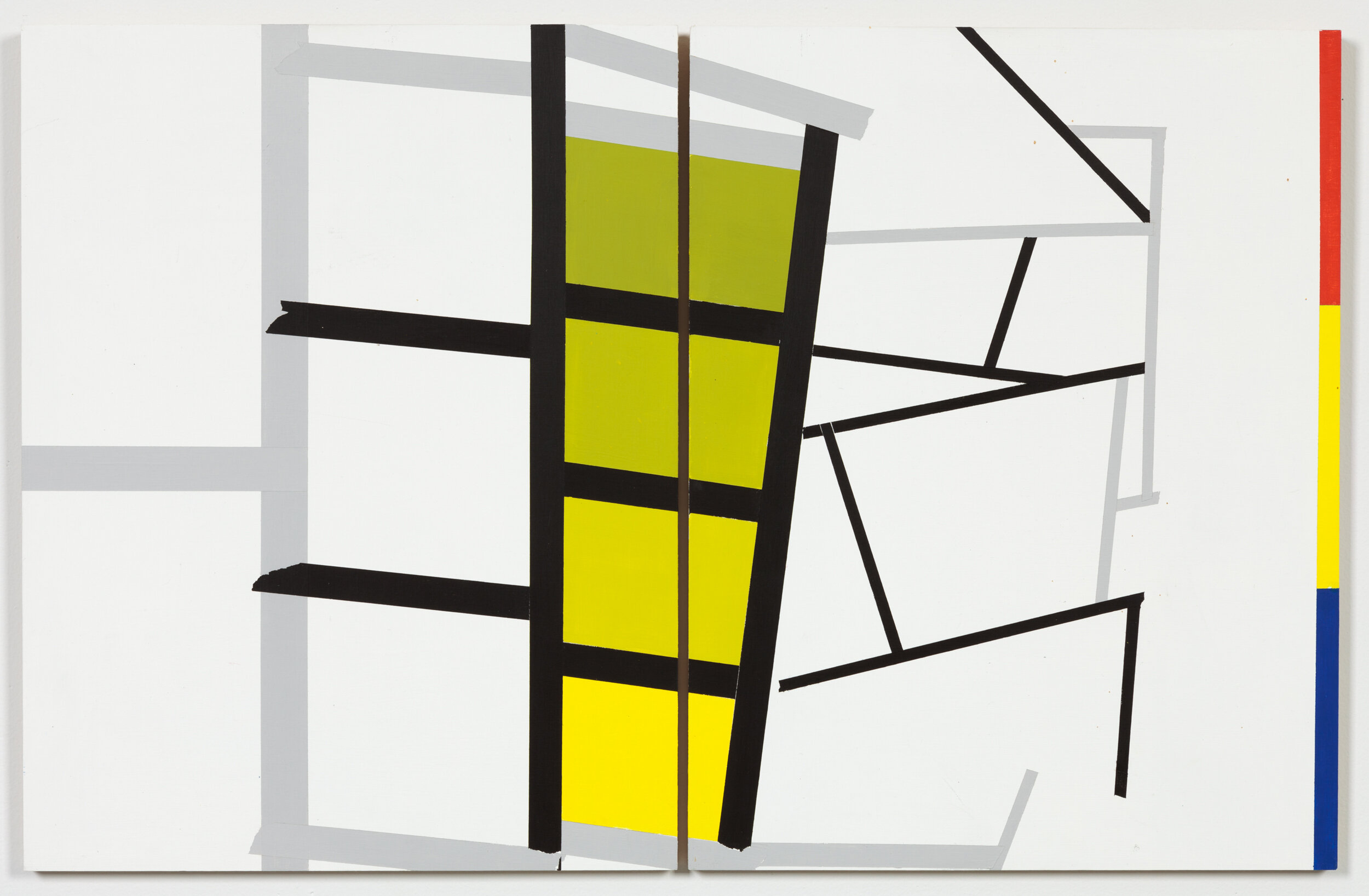
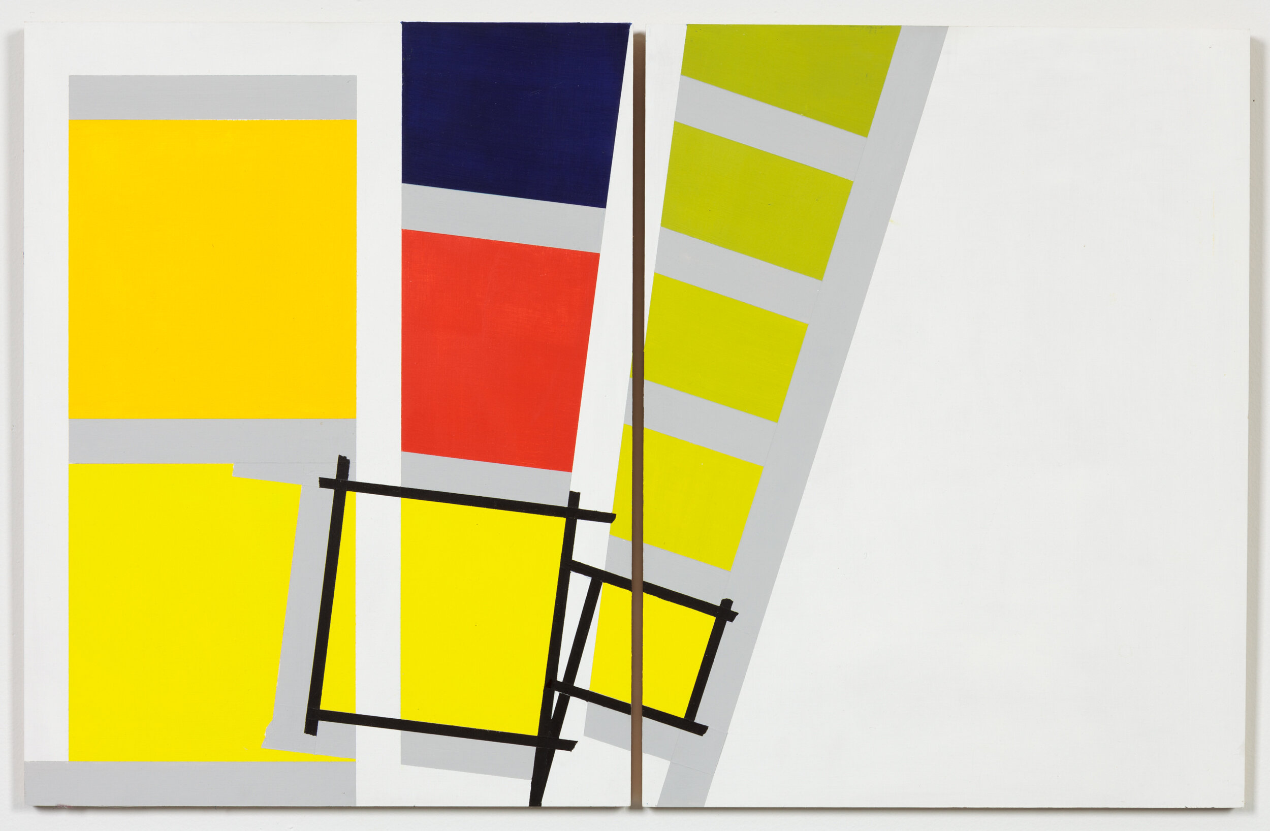
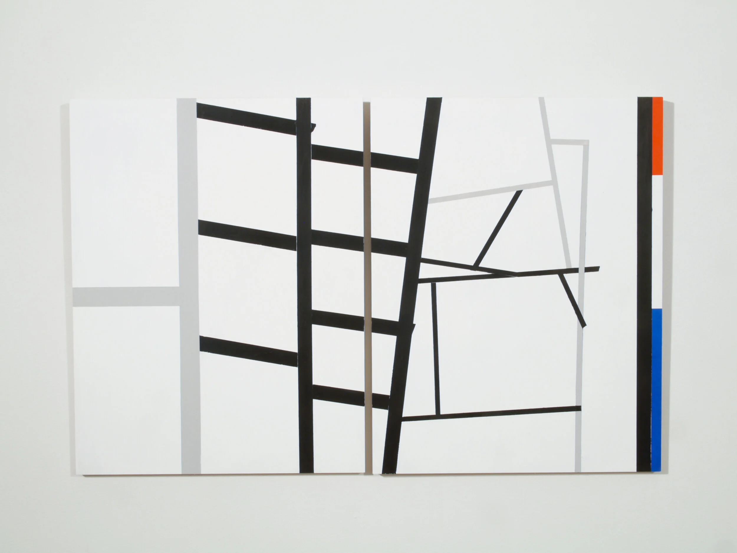
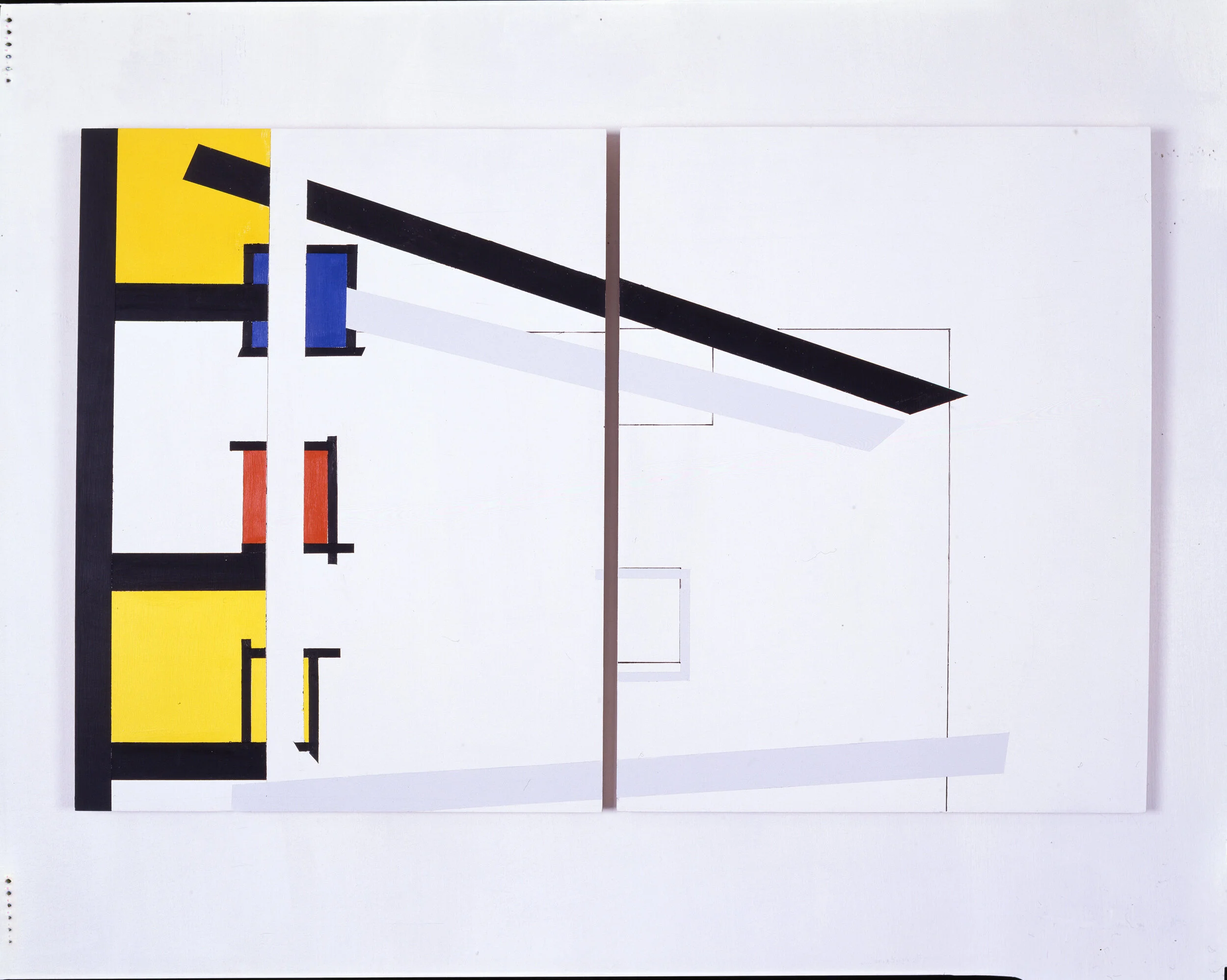
Where is the true red, yellow, blue? –Marjorie Welish
Here is a diagram of a painting problem. How does the same color—say, yellow—read in different contexts, especially where contexts are incommensurable? This series brings together different color palettes to reveal semantics of this “translation” from one scheme to another. Very much on my mind here is Jasper Johns and his According to What and related paintings, which declare the problematic of contesting structures, systems, and theories, through which to progress in significant ways. What strategies will be most consequential for art history? Where to begin? How to paint that question through a style at once visual and verbal? Johns’s semiotics is a strenuous investigation of decision, of the criteria informing a choice.


Works on Paper
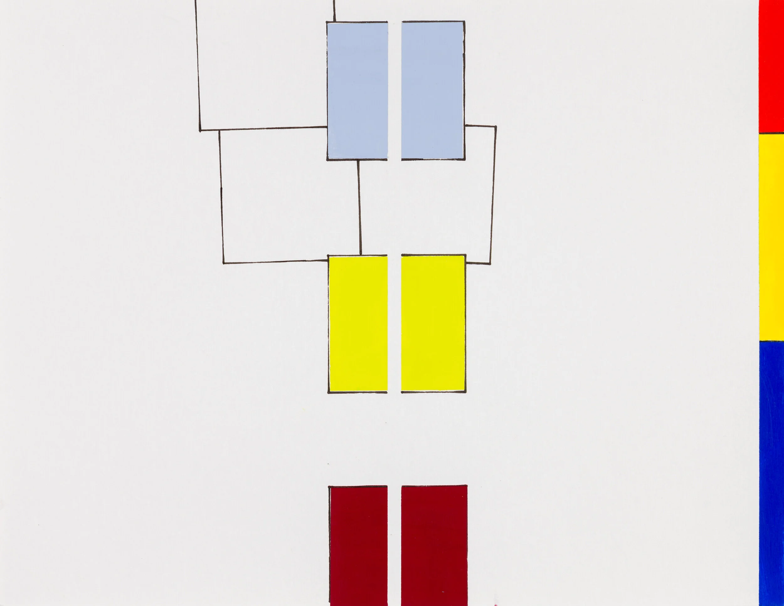
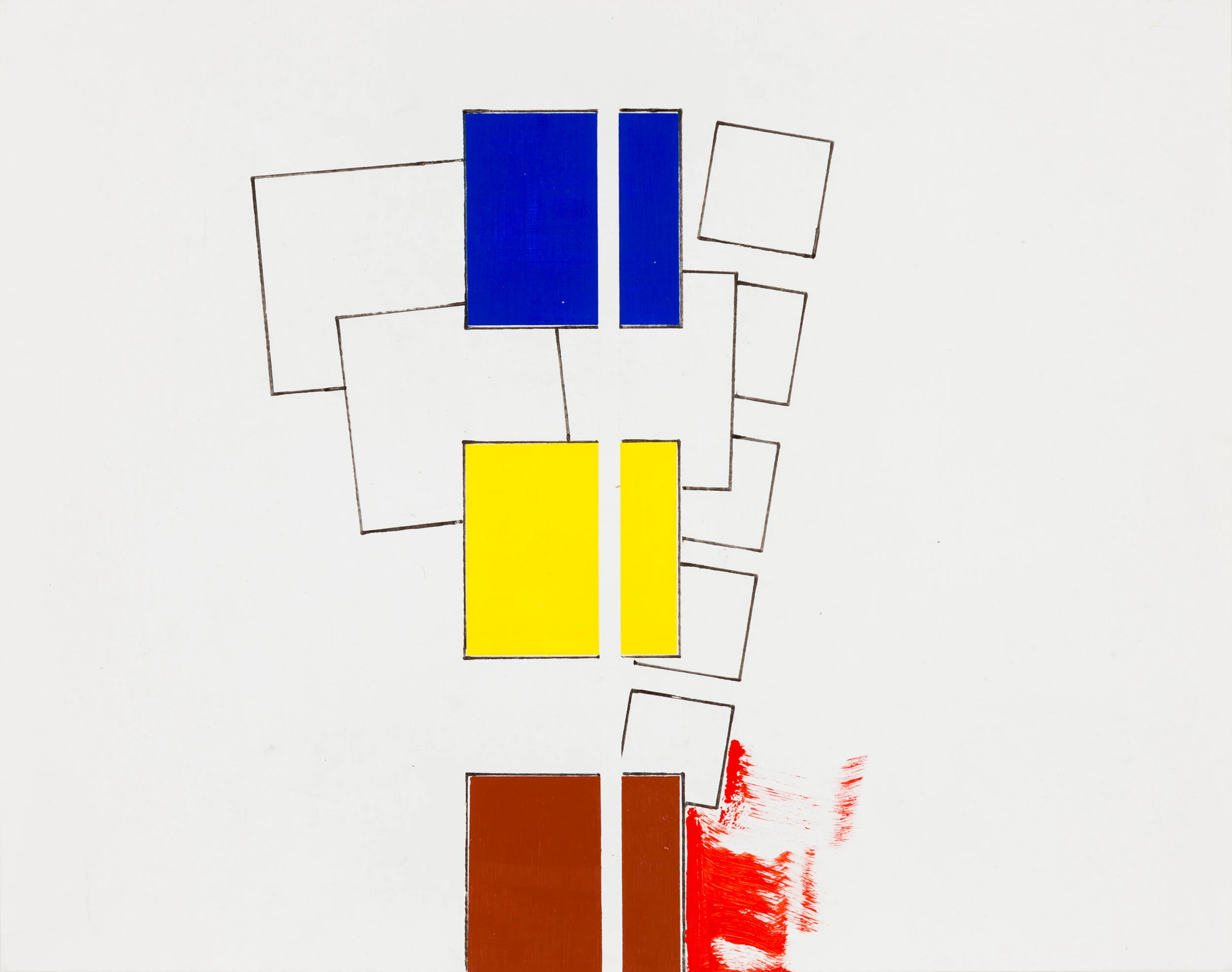
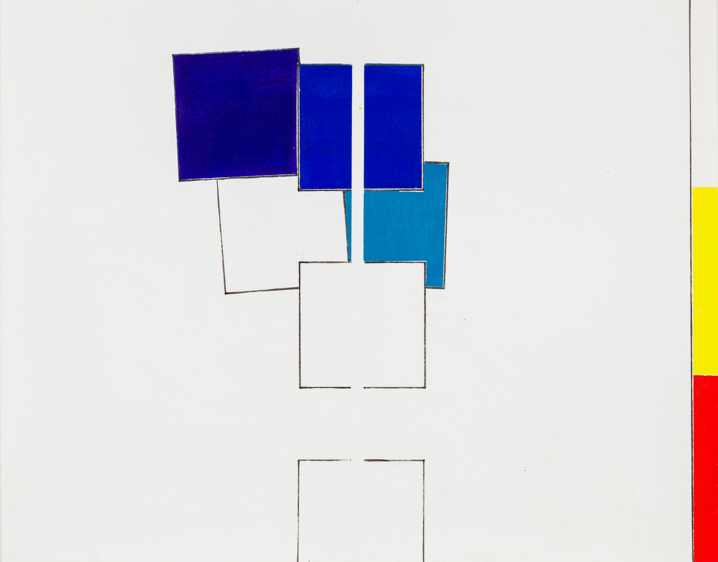
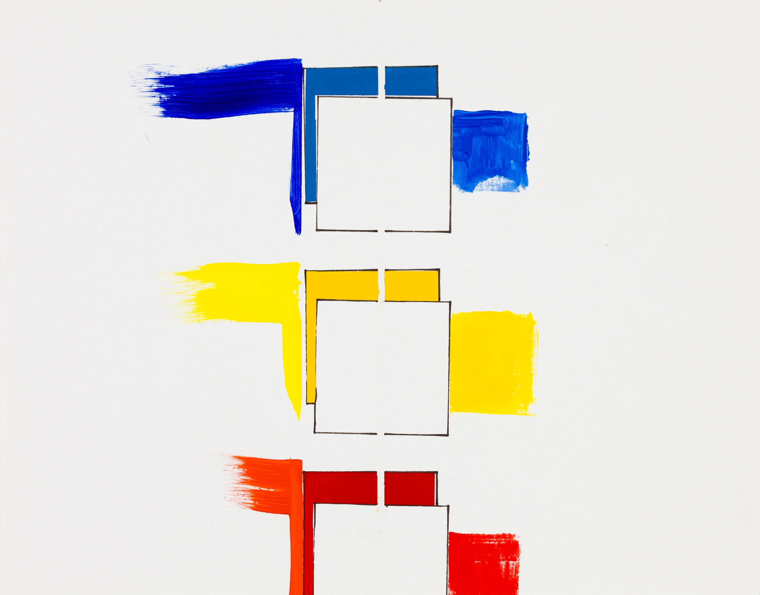
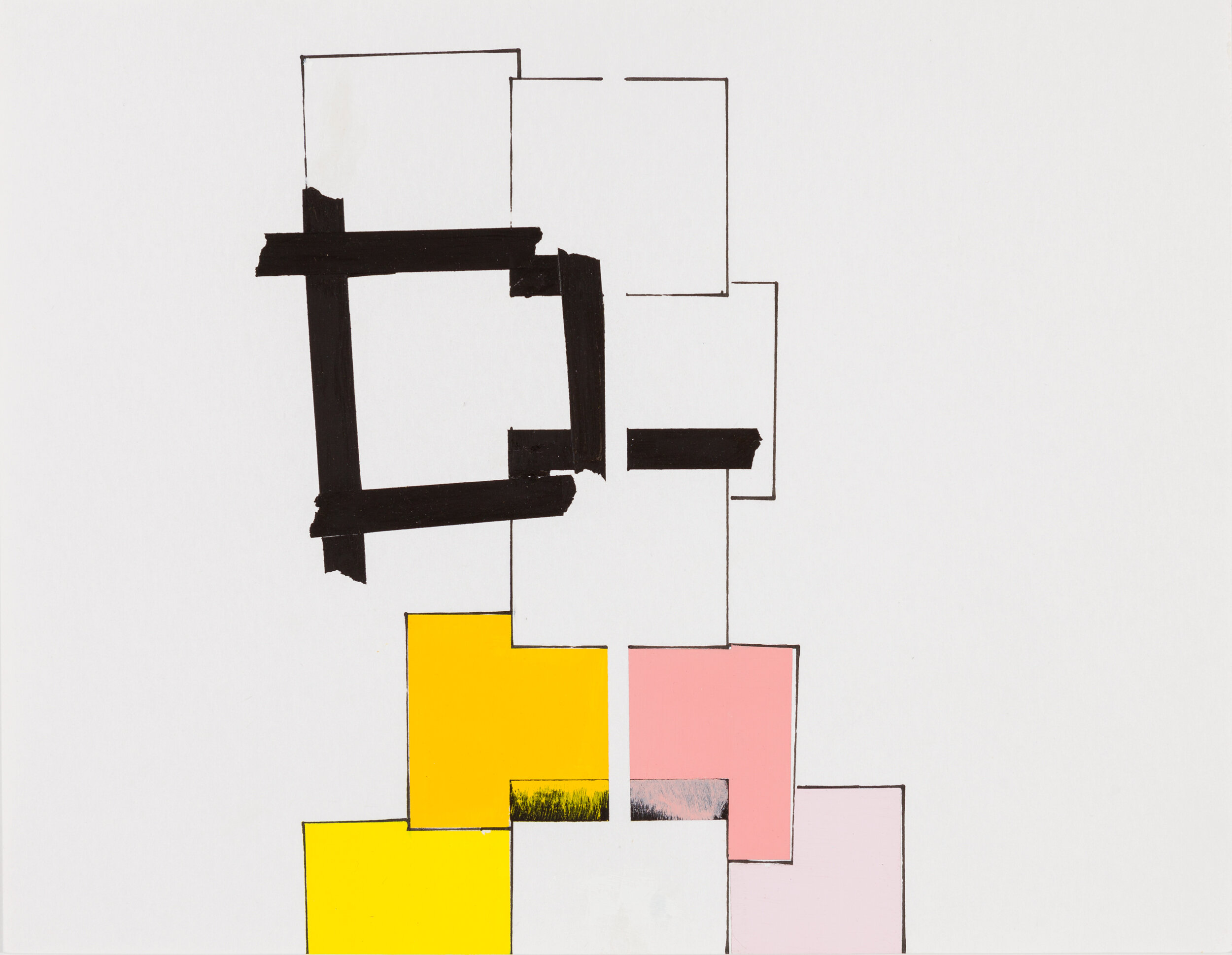
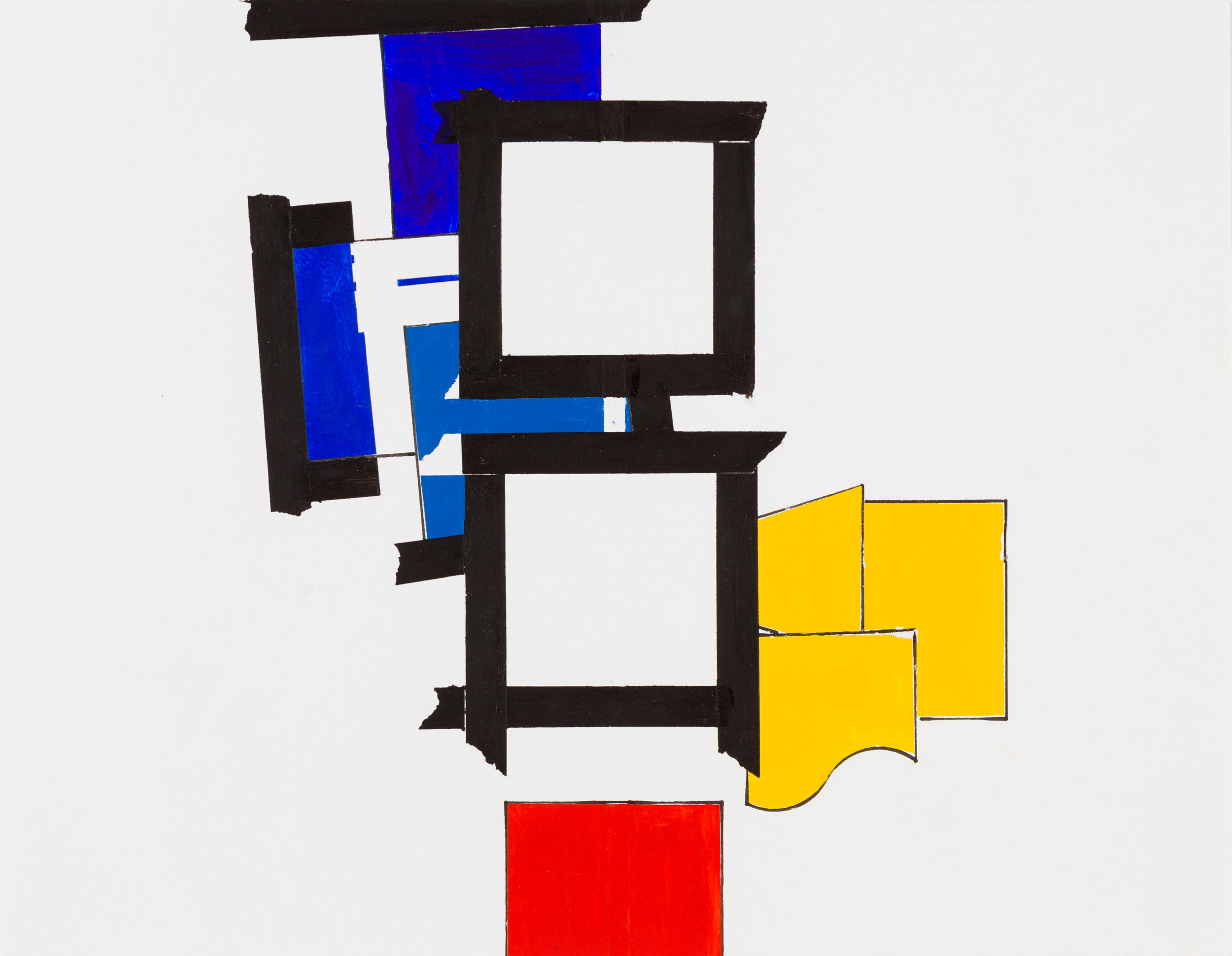

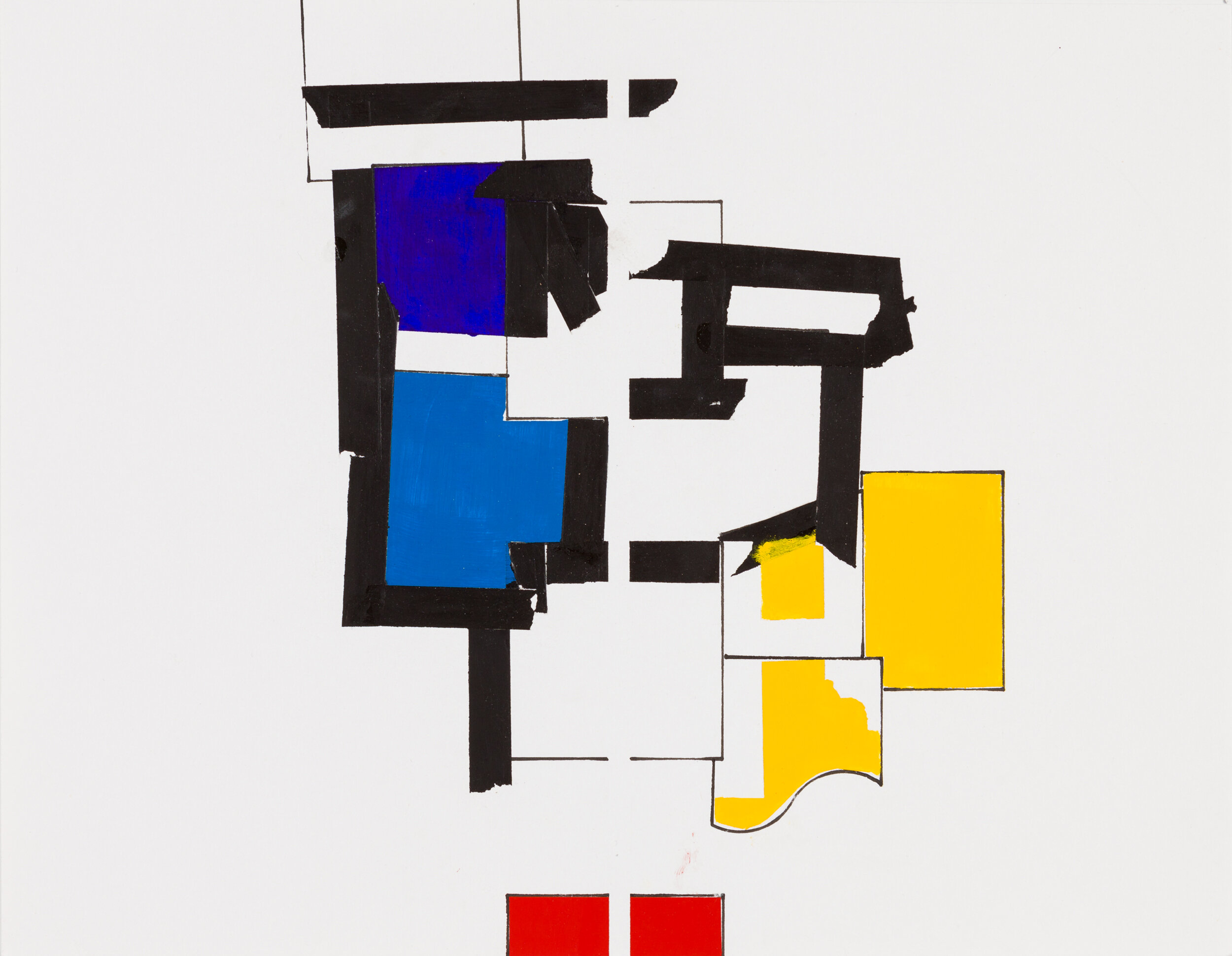
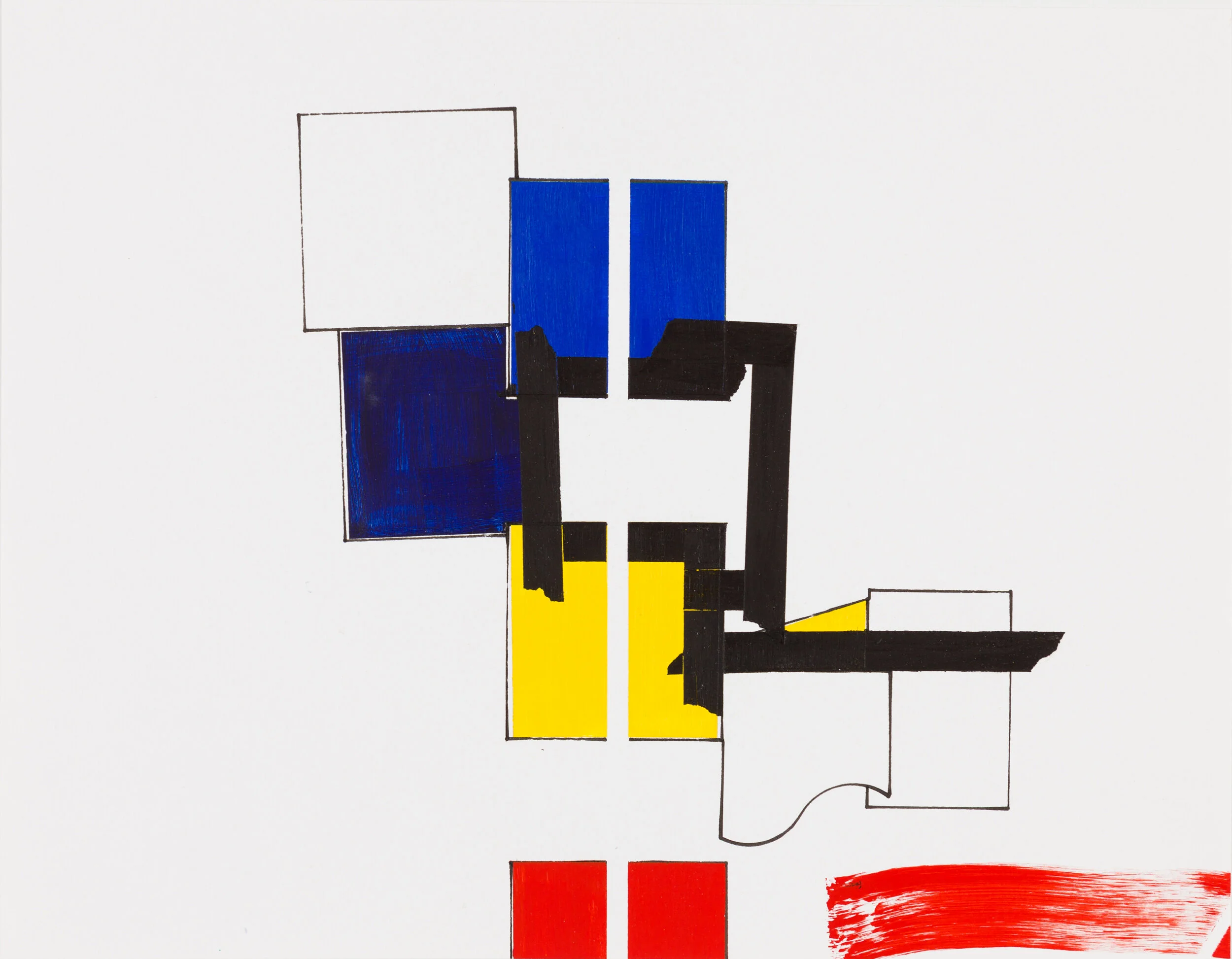
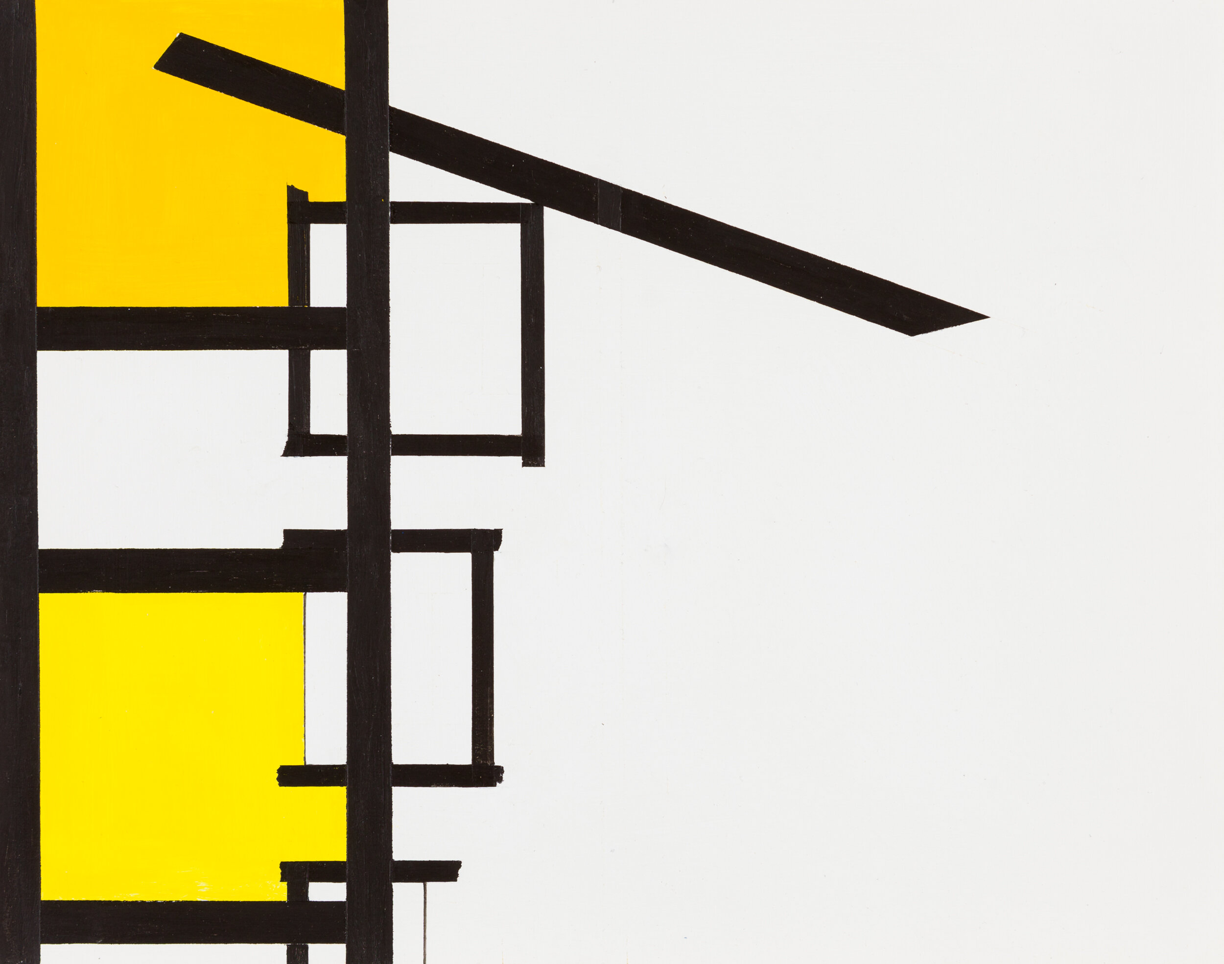
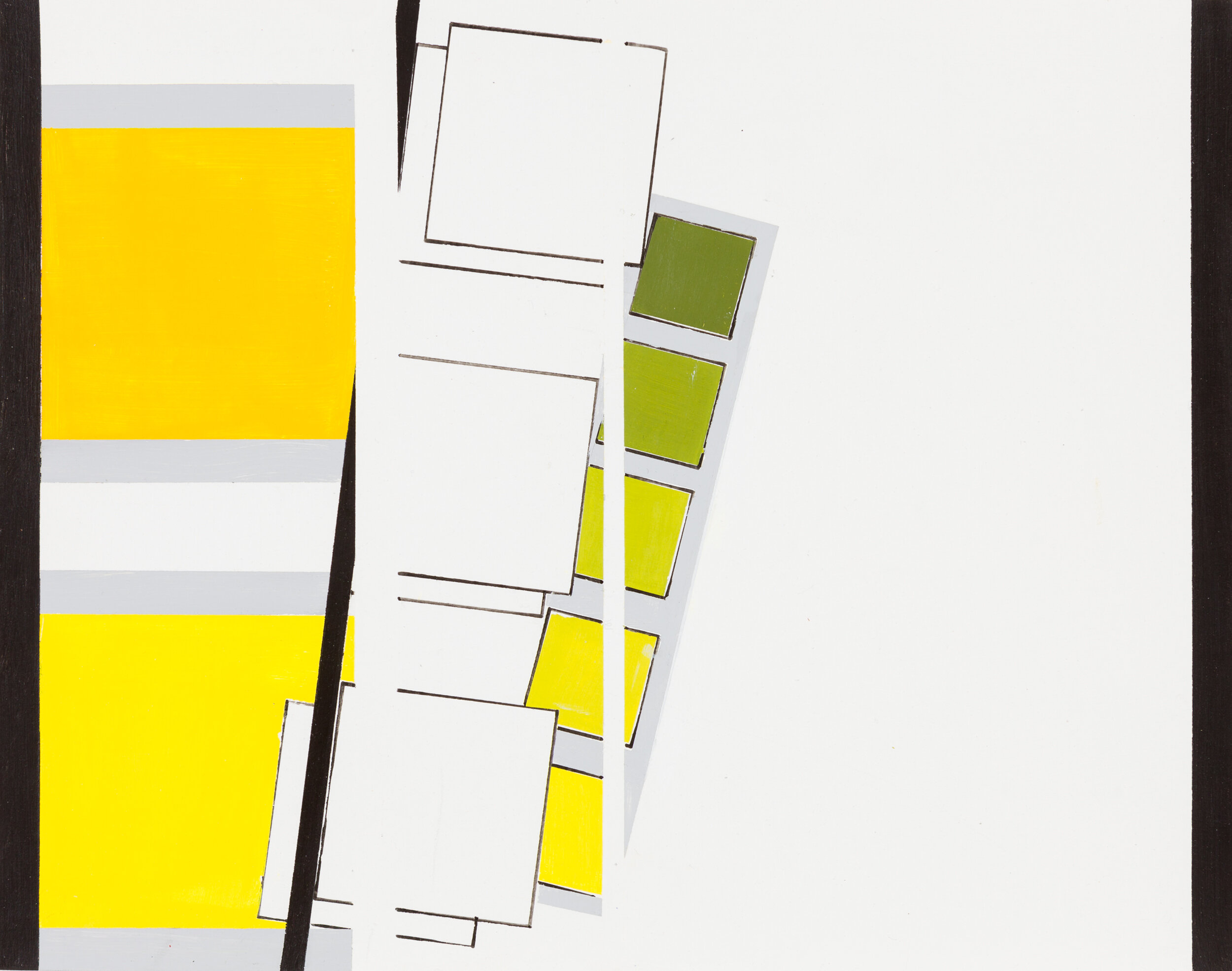
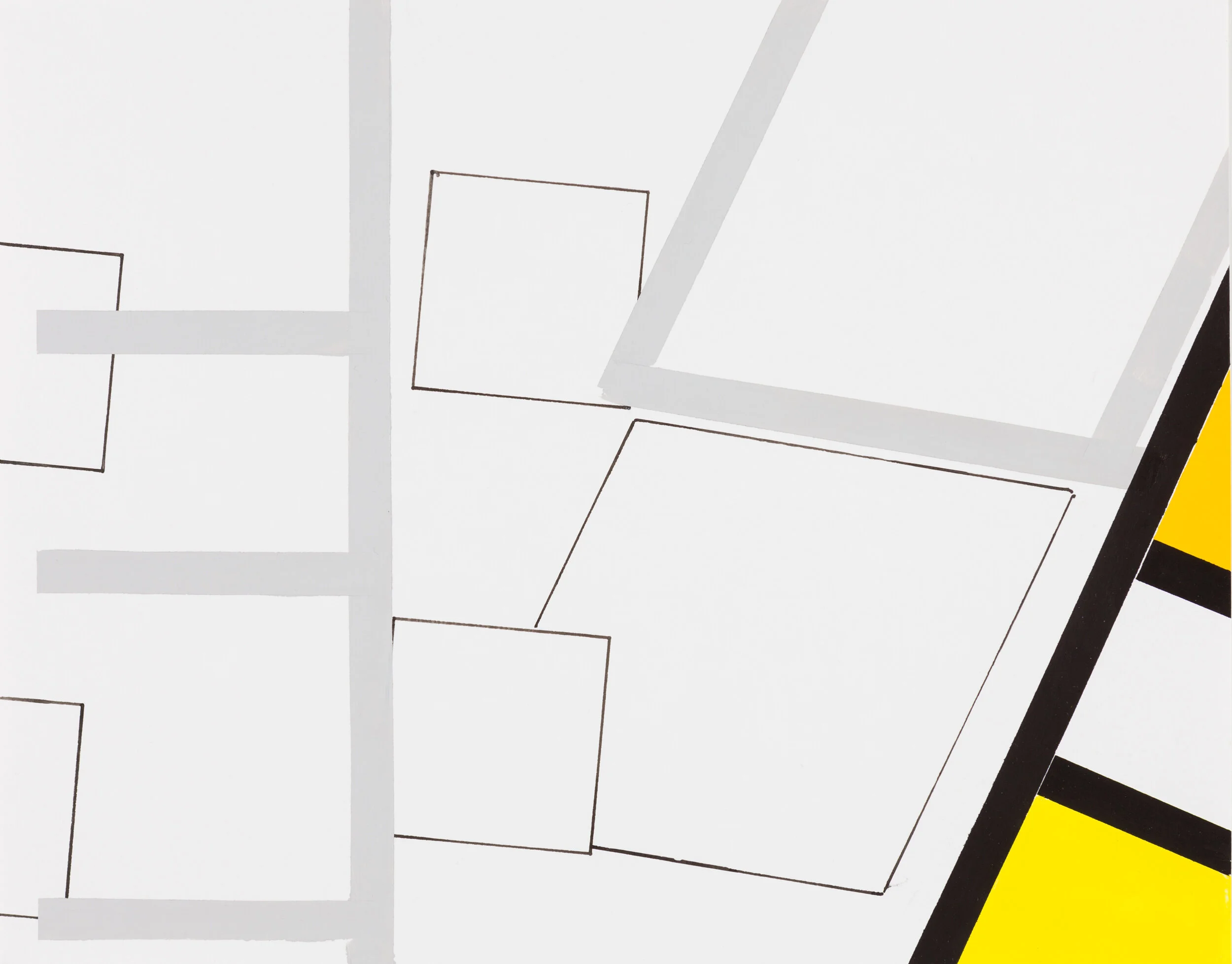


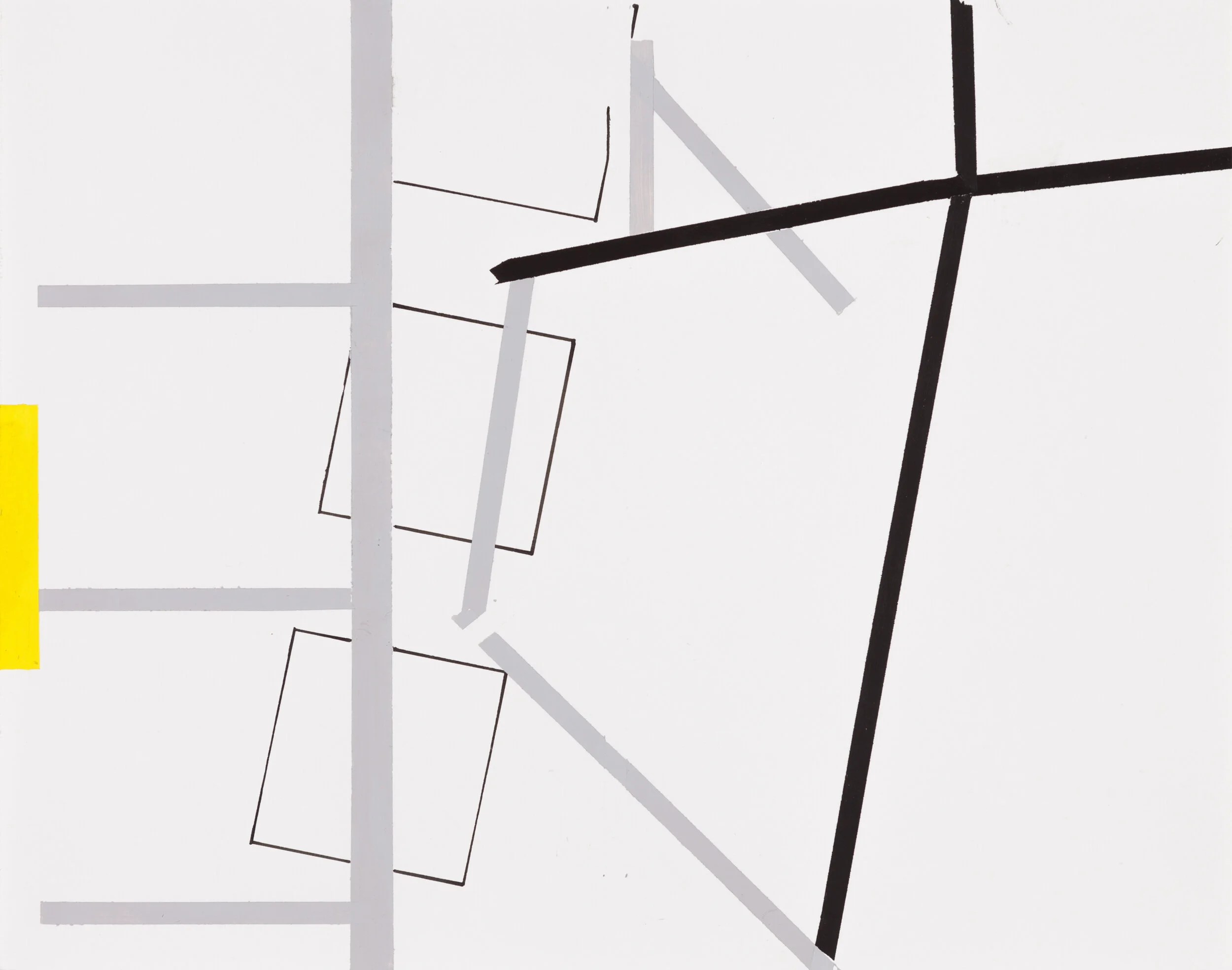
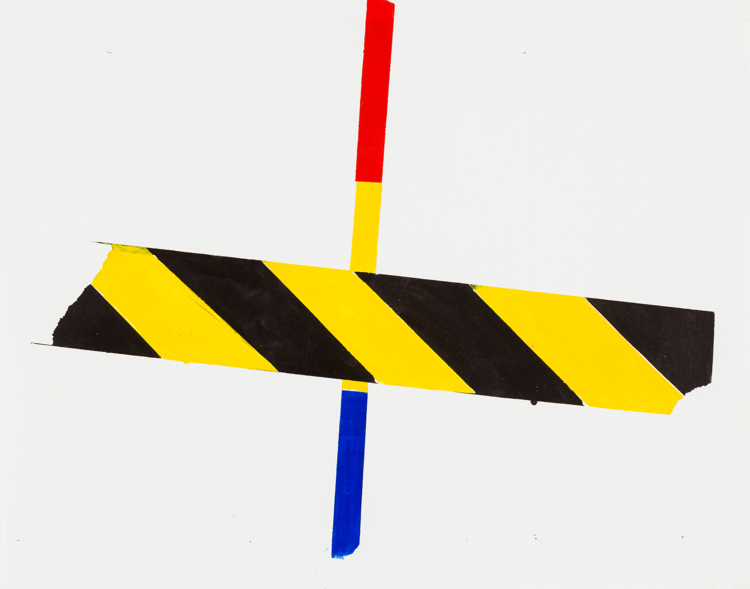


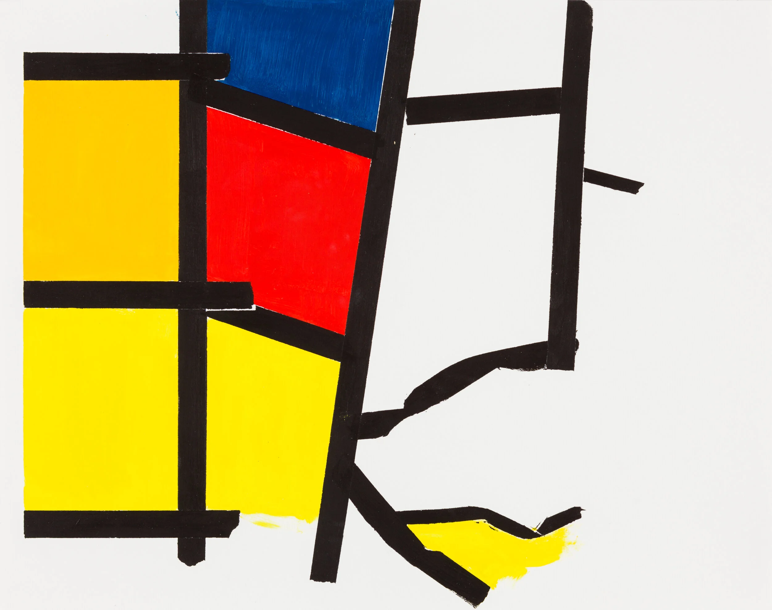
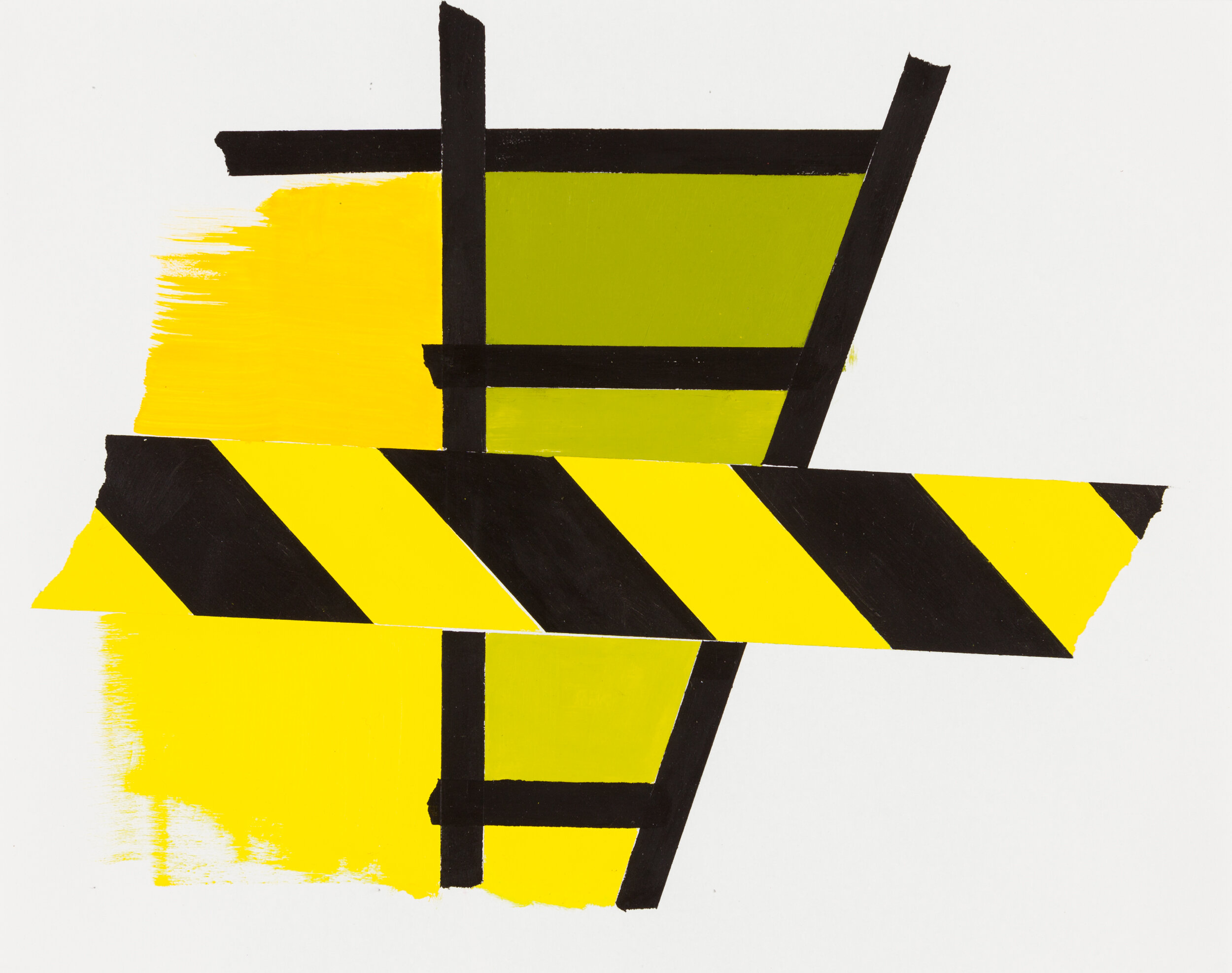

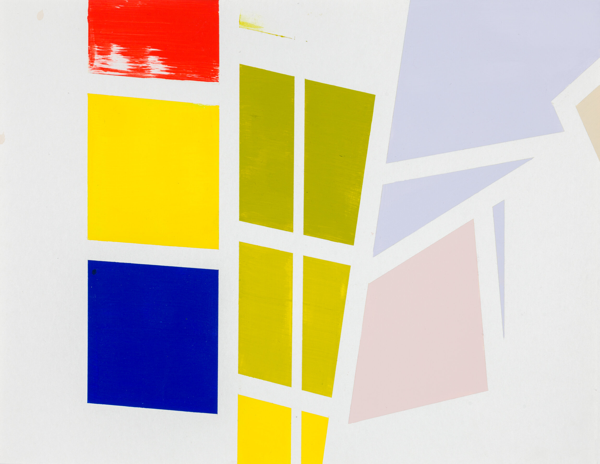
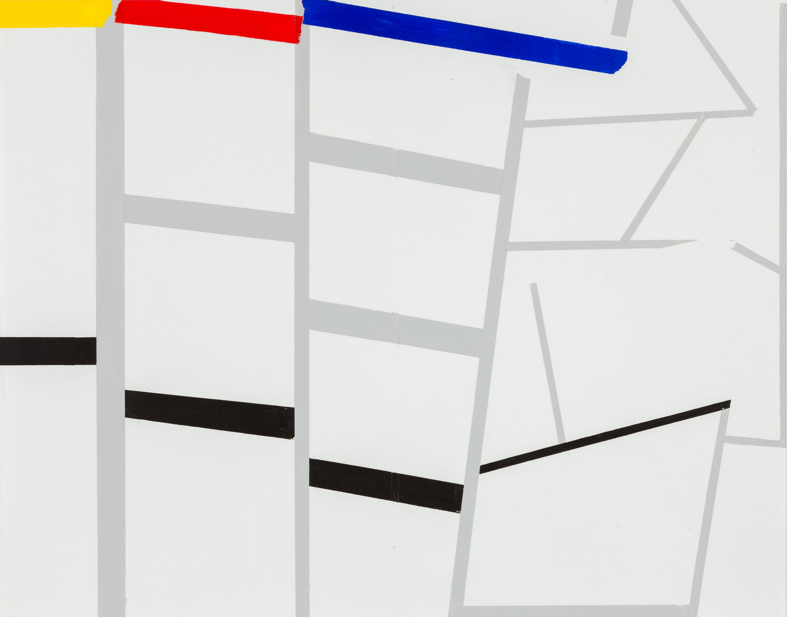

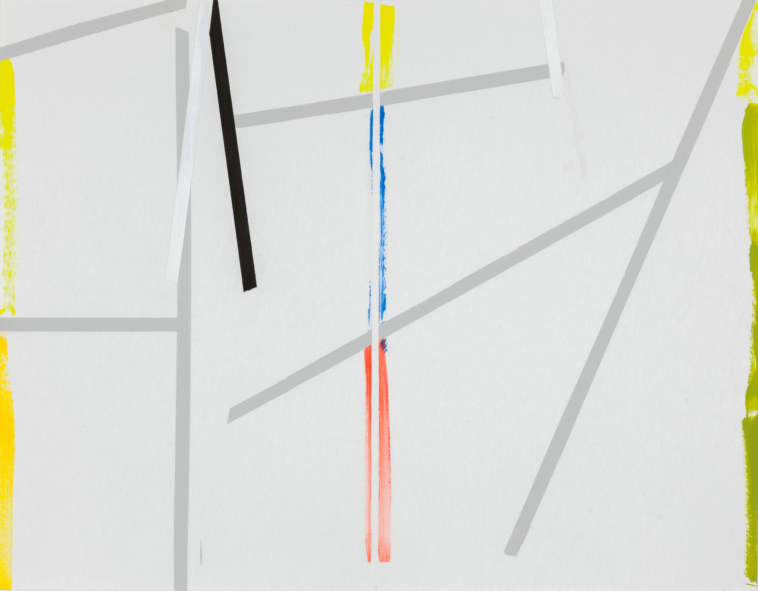
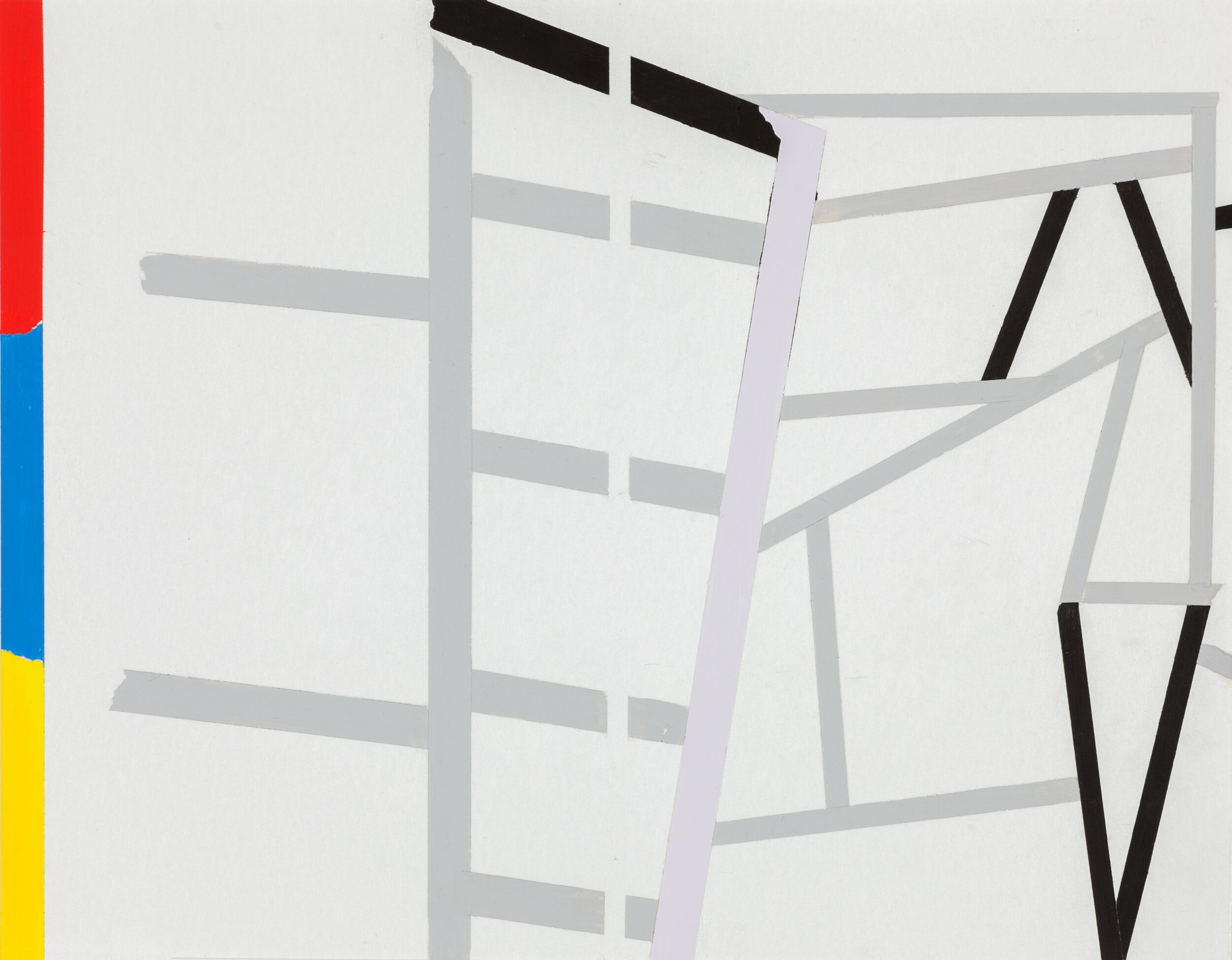
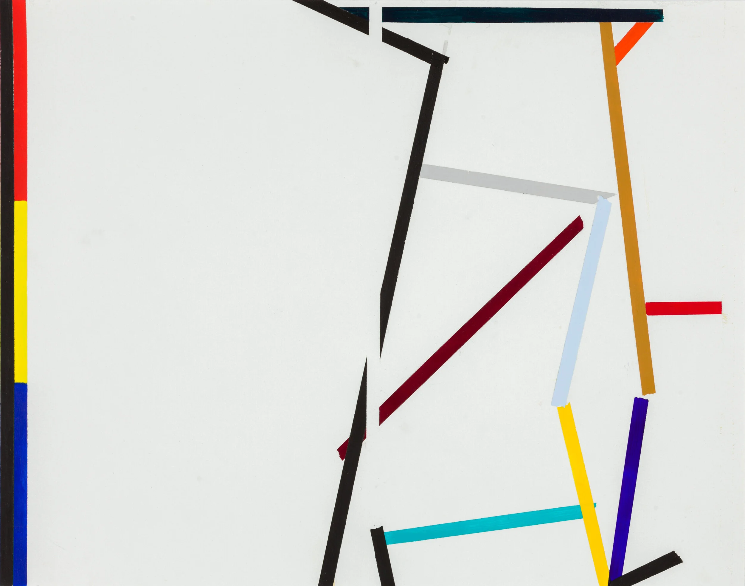
To engage with that semiotics is the point of INDECIDABILITY OF THE SIGN: RED, YELLOW, BLUE. The primaries emerge from the frame of modernism—its ideology, if not always its practice. What is this sign of modernism? Is it answerable to another sign, say, of non-primaries? What if one of its primaries was absent; how would the sense change? Or if it were answerable to a continuum of a yellow, shading from its own unmixed hue to –not a darker yellow exactly—a morphed yellow becoming greenish? Identical yellow sampled but producing non-synonymy not only in perception, these color swatches are informed through differing cultural contexts: Red, Yellow, Blue—a reductive modernism; this is non-identical with the yellow shading darker, becoming greenish—a decorative design sample.
See Of the Diagram: The Work Of Marjorie Welish (Slought Foundation, 2003) the conference book devoted to the artist’s practice.
Soon after Norma Cole and I first met, as I pulled out a small square of paper on which were painted two yellows, she responded by pulling out a printed swatch of incremental grays. From her contribution to the conference comes this:
“Comparison” is from compare, to speak of or represent as similar, to liken, making parallelisms that don’t quite match up; and Welish is interested in difference. “Competition” is from competere, to fall together, coincide, come together. Petere itself is to fall upon, aim at, make for, try to reach, strive after, sue for, solicit, ask or seek. […] Can’t have difference without the other thing. […] Difference in repetition. […} … a fundamental neural, cognitive, epistemological tool. A structure of finding out.” From “Yellow and…”
EXHIBITIONS links to Ressle
https://www.haberarts.com/nad08.htm As usual for John Haber, this review elevates the discussion through theoretical concerns that matter.
For a show of works on paper, see – https://www.evbaeyer-cabinet.com/exhibitions/indecidability-sign/
literature on these series, SIGN: FRAME, SIGN: RED YELLOW, BLUE, WITH/WITHOUT, and WITH / WITHOUT, and THE HIGH VALLEY—and what became of them, there is much to report.
In 2002 an all-day conference on the arts practice of Marjorie Welish occurred, which resulted in a 300-page conference book Of the Diagram: The Work Of Marjorie Welish --
For further discussion see the 96-page catalogue A WORK, AND…, Marjorie Welish with Lilly Wei in dialogue, 2016